Tofha · Launched
Building Tofha's online store as an extension of its Instagram shop
Tofha is a handmade gifting brand with an audience on Instagram and every order coming in by DM. The site had to take orders on its own without losing what made the DMs work.
Overview — Building an online store for a handmade gifting brand
Tofha makes bouquets, hampers, engraved glass, calligraphy and bookmarks by hand. Everything sold through Instagram, one DM at a time. The store had to carry the catalog on its own and still feel like the same shop. It ships pan-India and delivered over twenty orders in its first month.
Designing for Two Kinds of Buyer — Designing for people who know the gift and people who know the person
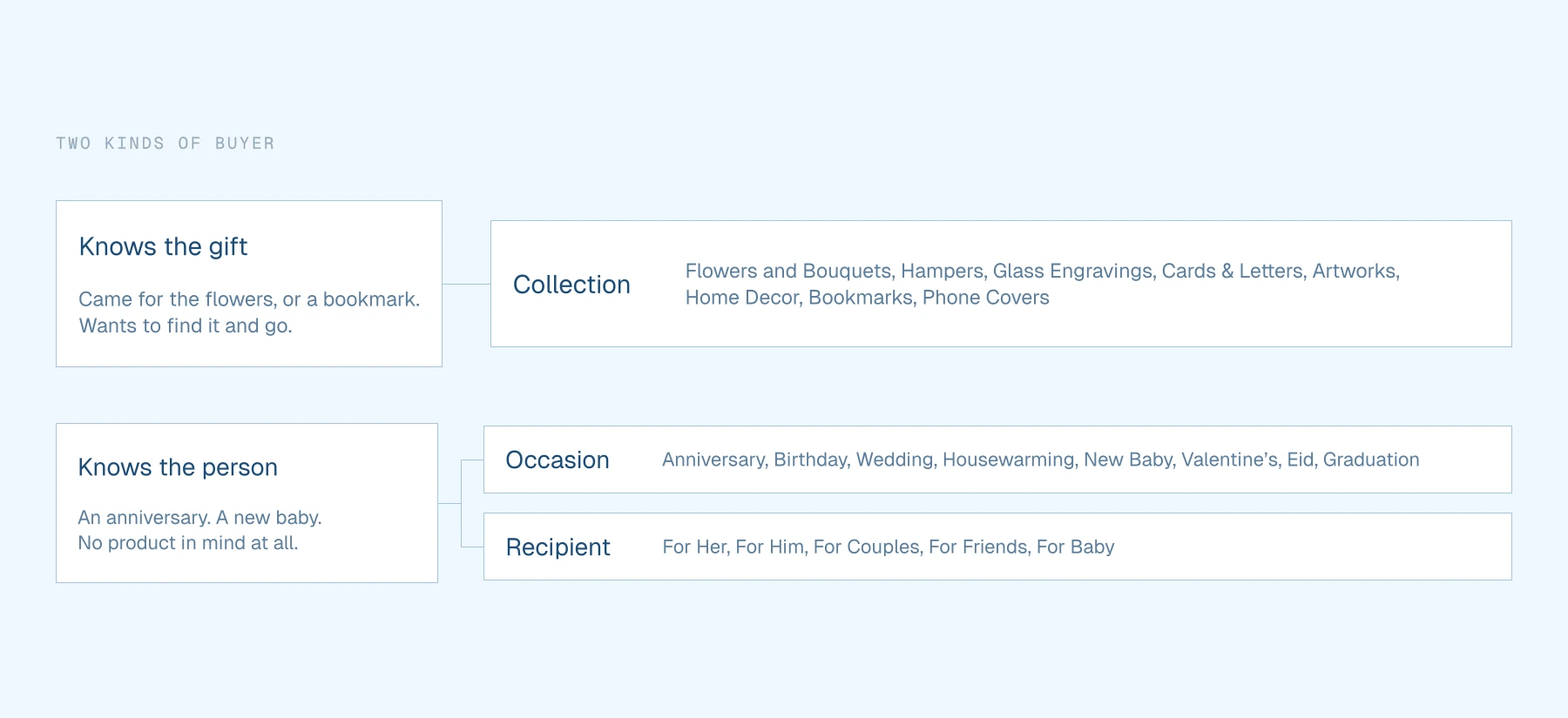
Someone buying a gift doesn't always know what they're buying. Often they only know who it's for.
- Someone who knows the gift. They came for flowers, or a bookmark, and want to find it and go.
- Someone who knows only the person or the occasion. An anniversary, a friend's birthday, a new baby, and no product in mind.
- Most people cross between the two while they browse, so these aren't two separate paths.
A store organised by product category serves the first person and leaves the second one guessing. So the catalog carries three ways in at once, and none of them is the main one.
Structuring the Catalog — Filtering by collection, occasion or recipient on one page
The shop puts all three axes across the top. Switching one swaps the grid in place, so nobody has to back out to a menu to change their mind. The homepage opens on the same split, so the choice starts before anyone reaches the shop.
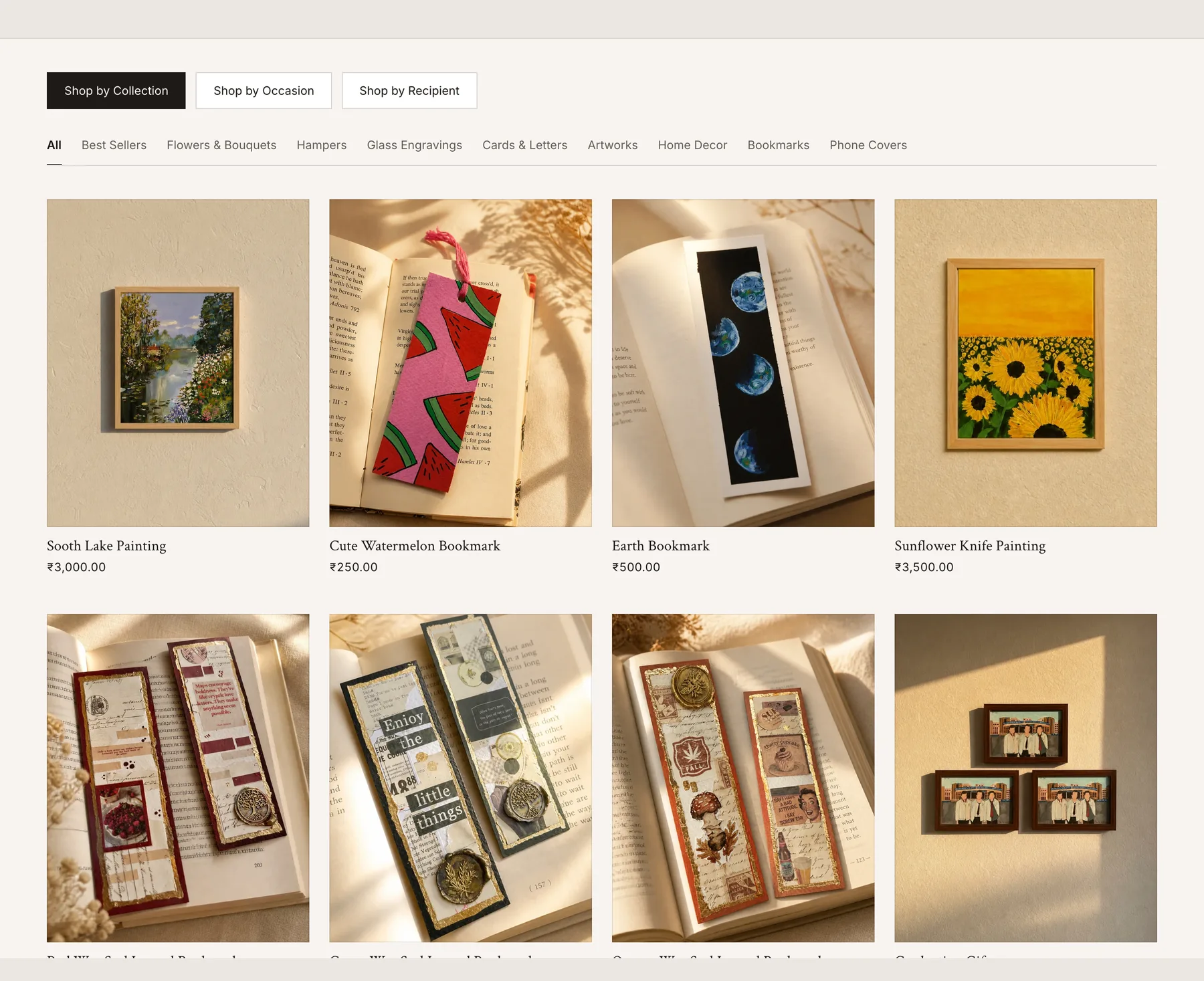
The filters stay on the page rather than folding into a drawer, so switching axis costs one click.
Product Pages — Carrying the Instagram upsell onto the product page
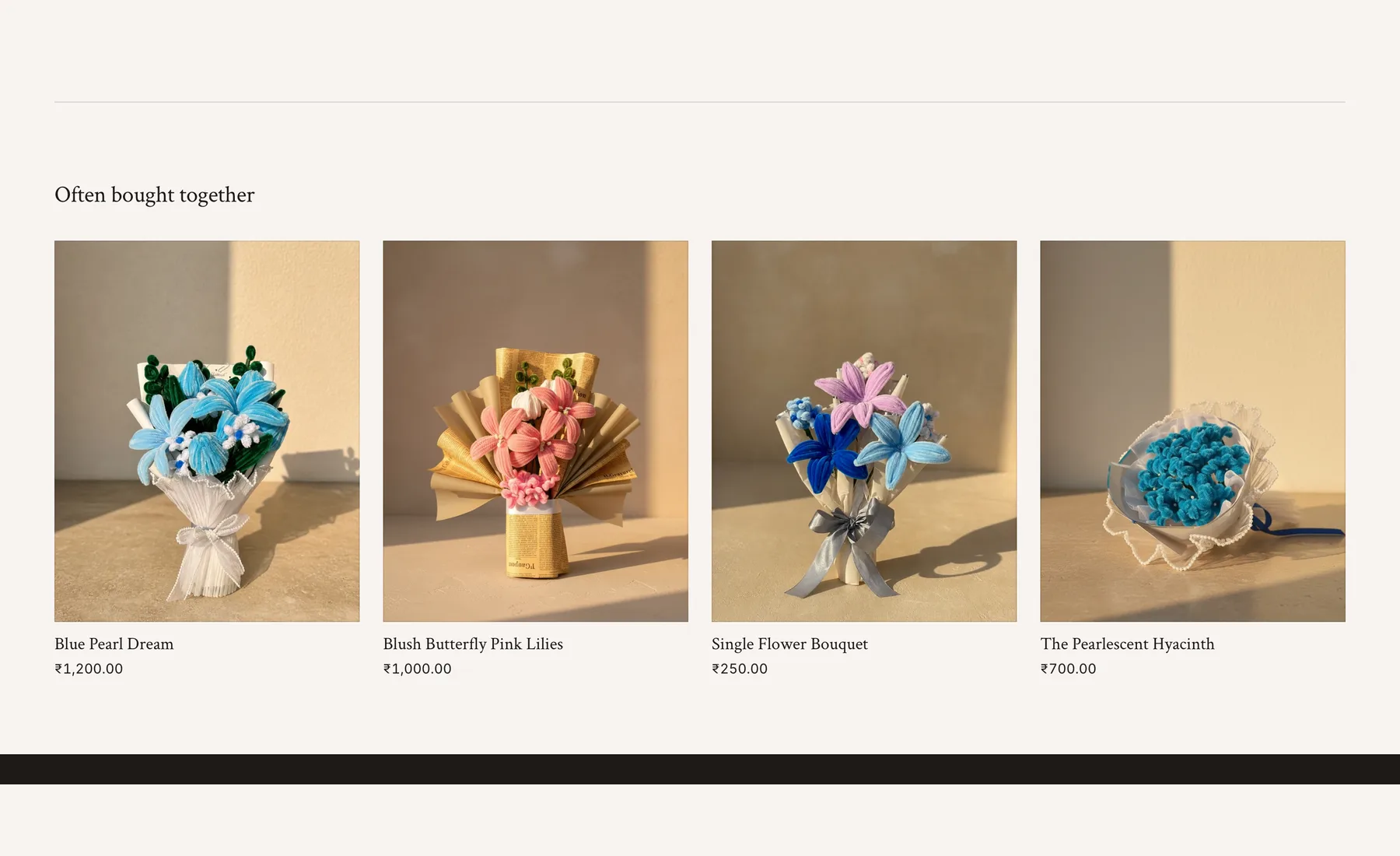
Buying over DM is one long conversation. Someone asks about a bouquet, the creator shows them a card that goes with it, and the order grows before it’s placed. Often Bought Together sits under each product to keep that going, running on relationships set between products.
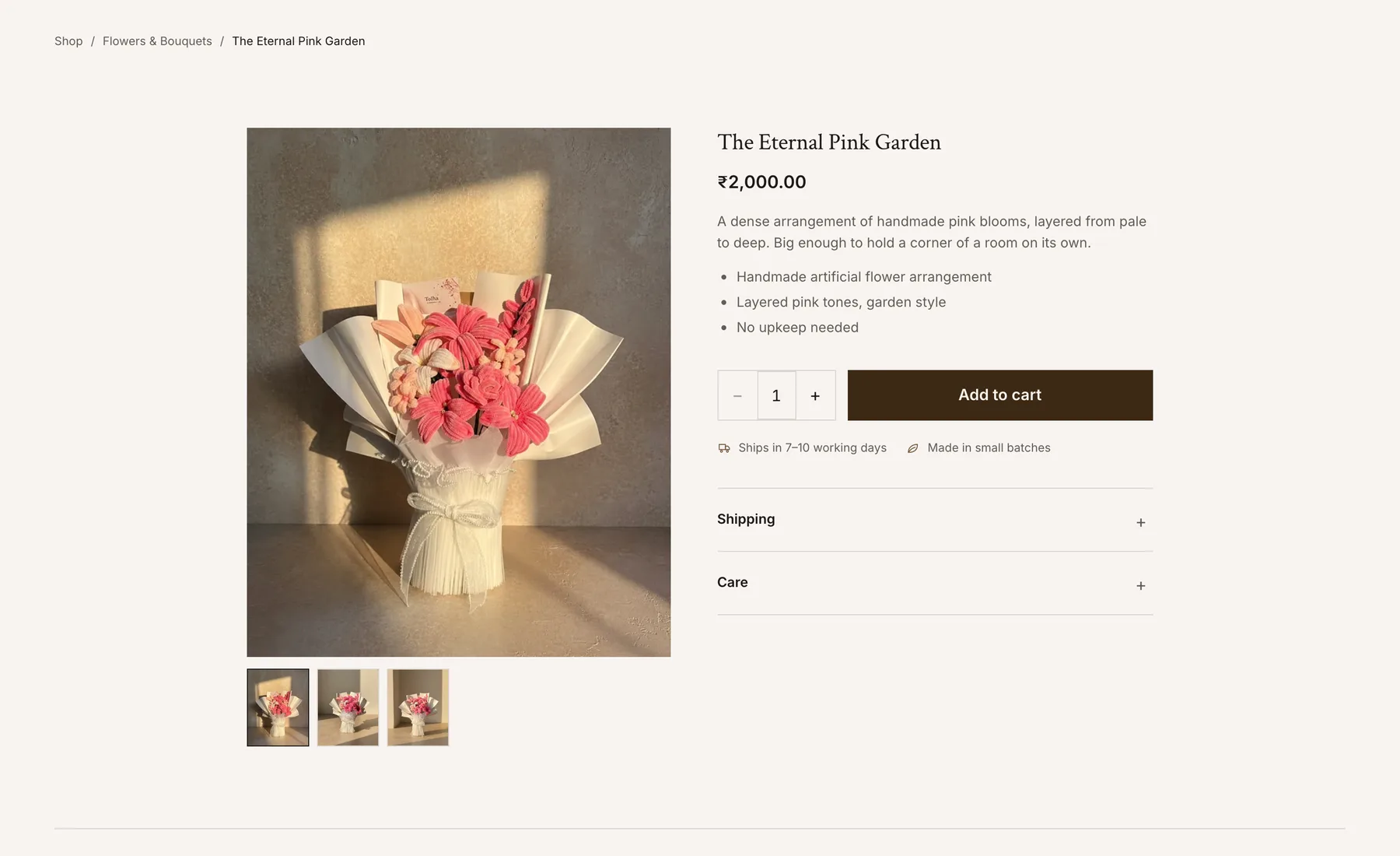
Price, what's in it, dispatch time and the small-batch note all sit together above the fold.
Workshops and Enquiries — Booking a session and asking for a custom order from the same site
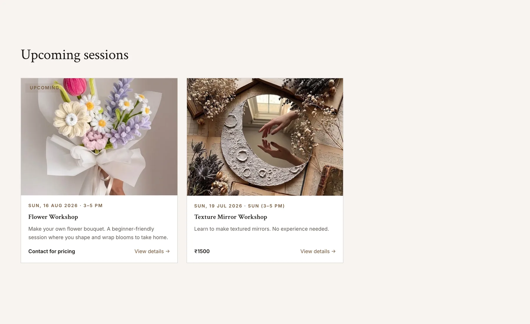
The creator runs craft workshops, so the site sells those too. Sessions carry real dates and a plain description of what a beginner actually does. On the contact page one form changes with the enquiry, so a custom order, a bulk order, a workshop booking and a live session all start in the same place.
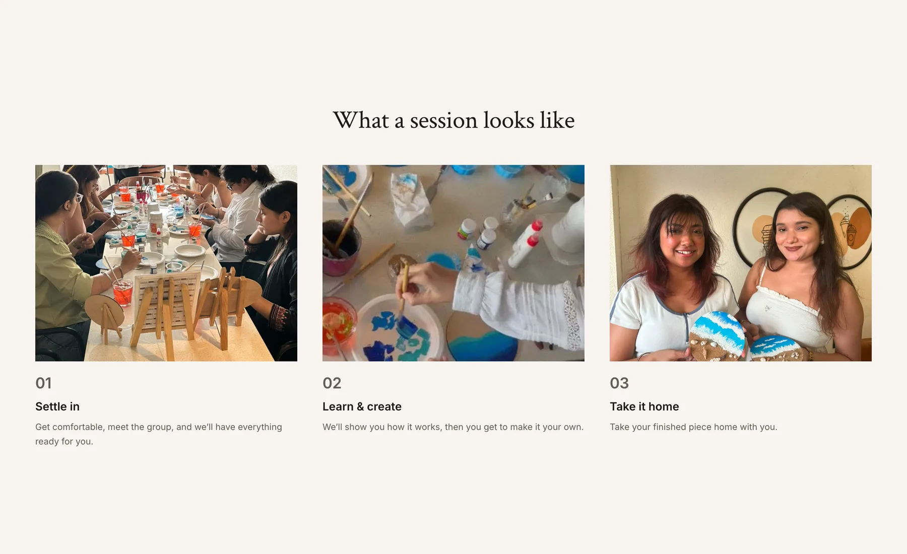
Naming the three steps was the quickest way to answer the question a first-timer actually has.
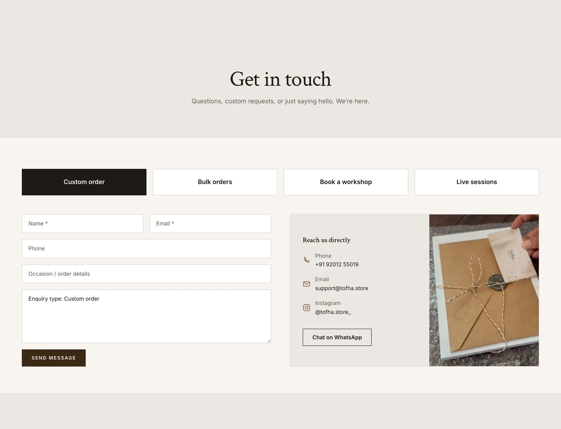
A WhatsApp button sits beside the form for people who'd rather just message.
Build — Designing in code on Shopify Hydrogen
The layouts were built in Hydrogen as they were designed. Products and collections, payments and order notifications, the product relationships and pincode-based delivery estimates all got set up in the same pass.
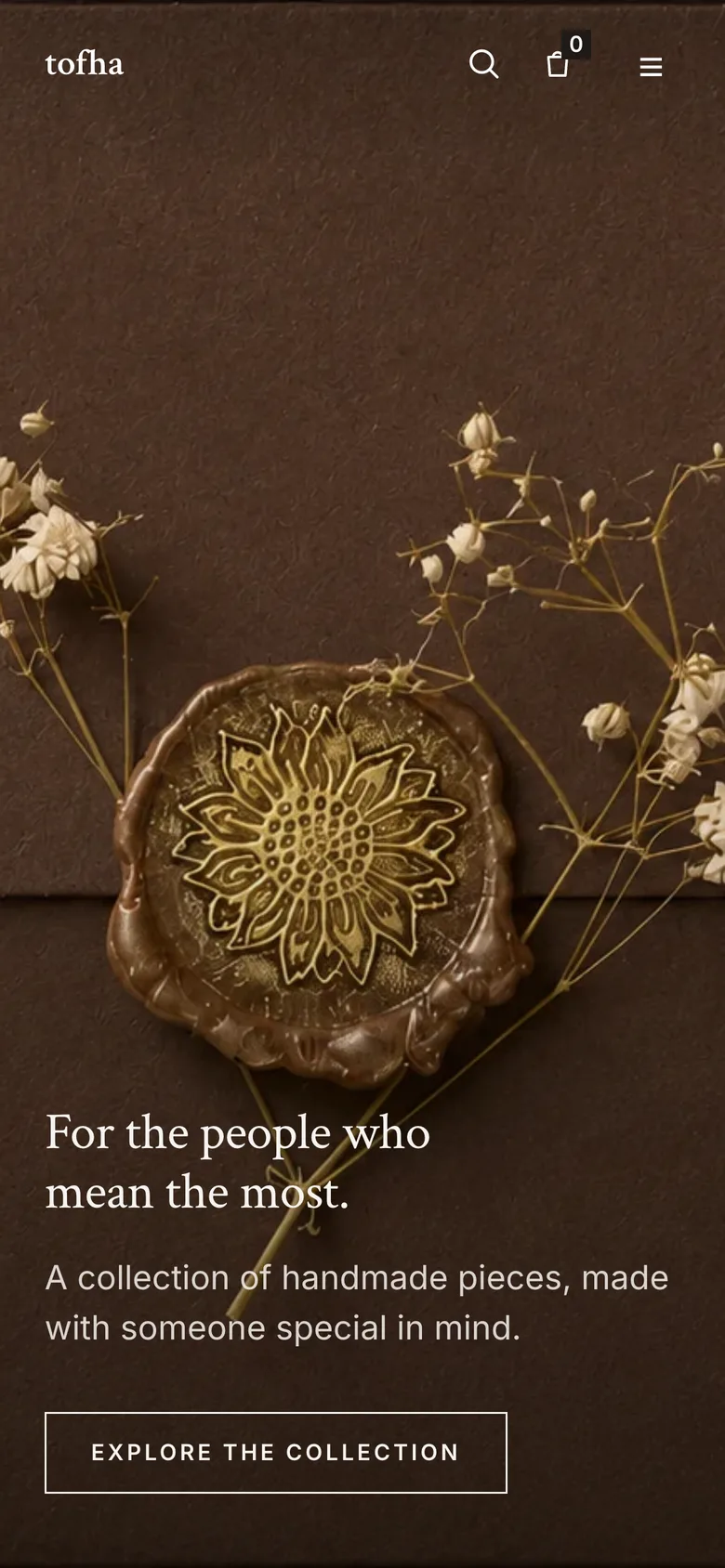
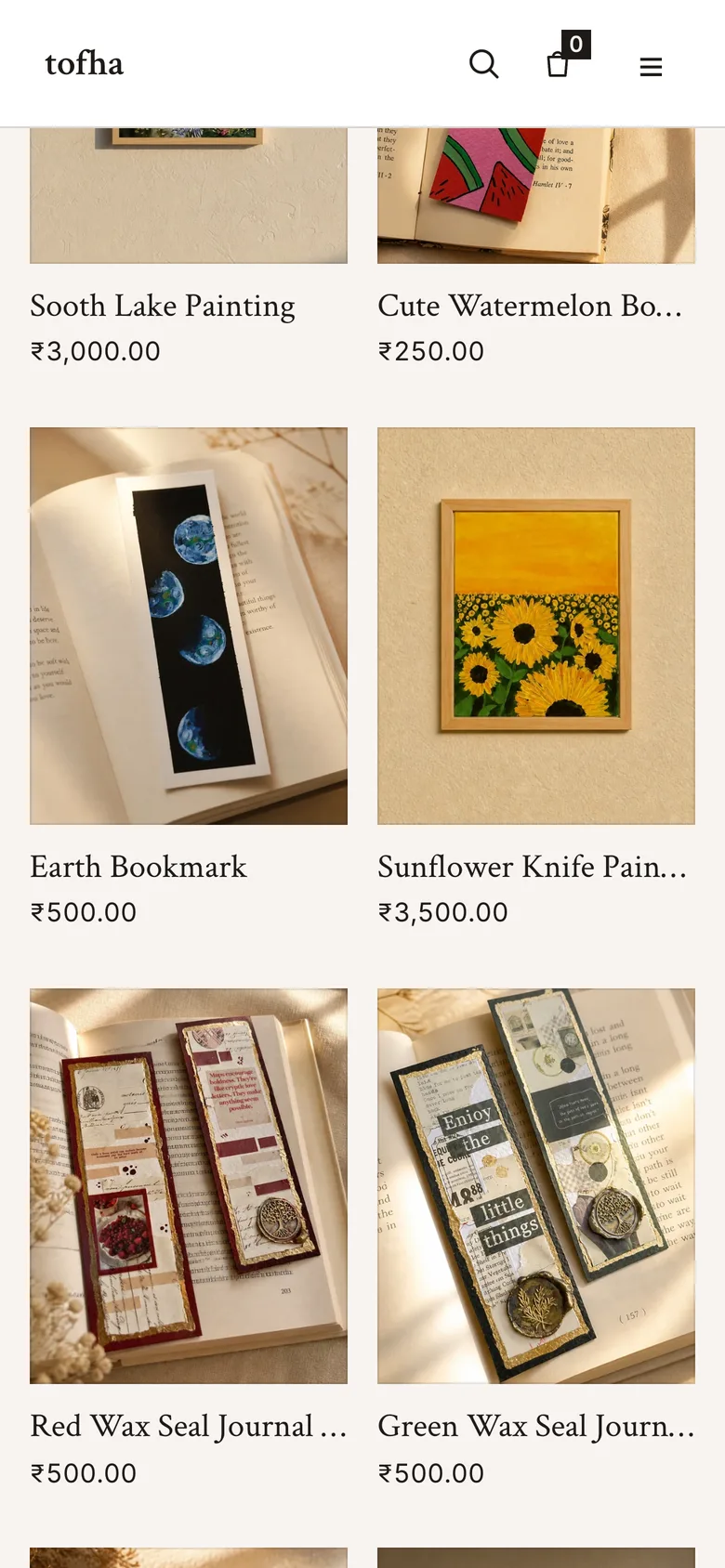
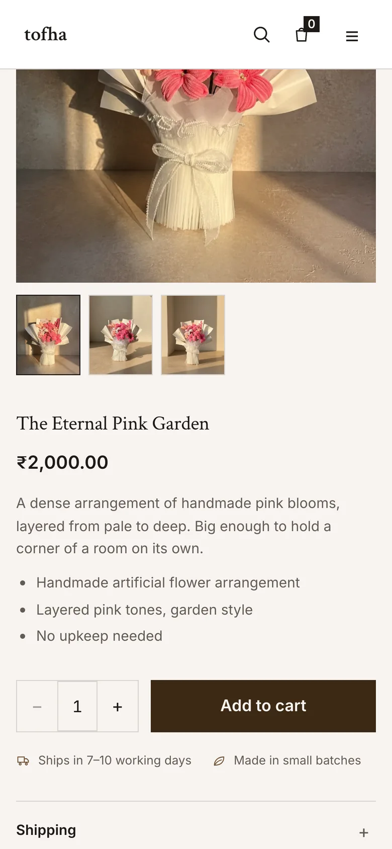
Most of the traffic arrives from Instagram, so the phone layout was the one that had to hold.
Reflections — What I learned
Designing in code makes you commit early.
Building the layouts in Hydrogen as I designed them meant fewer states that nobody would build, and every layout had to survive real product photos on the first try. It also made exploring more expensive, so I explored less than I would have in Figma.
A shop is only half the store.
Most of what Tofha sells starts as a conversation. The contact page and the custom order form ended up carrying as much weight as the product pages, and I gave them the least time.